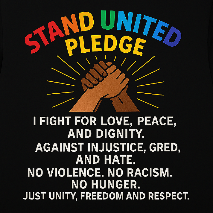
When creating T-Shirt designs for "Stand United" I thought adding bright color was a good thing to do as well as adding a sufficient amount of text or images that allows people to understand what the brand represents.
In today's word people are so superficial they are paying more attention to the aesthetics than the message and that alone is causing them not to place an order.
If the message is not more important than the design, we are going backwards or at best trapped by our own superficiality. We’ve turned activism into aesthetics — and in doing so, we’ve silenced some voices we claim to uplift. A rainbow doesn’t make a statement; a message does. If people won’t wear a shirt because it’s “too bold” or “not trendy enough,” then they weren’t ready to stand for anything in the first place. Stand United isn’t about fitting in — it’s about standing out for something. Let’s stop designing for likes and start designing for positive impact and legacy.
(note - I am fully aware the word greed is misspelled in the image, but left it that way to see who is truly paying attention and would reach out with a comment)
Topic Live


